Friday, December 12, 2014

Christmas & Winter Cards with Elizabeth Craft Designs!


Winter Mantelscape Project


If any of you have been following the Elizabeth Craft Designs blog, you know I have been blogging over there as a guest!  I have neglected my own blog...but now I am back here offering some BLOG CANDY from Elizabeth Craft Designs!  It is my most favorite die set of all, the Fancy Label Accordion Card die set.  I have been making what I call "mantelscapes" out of them.  The most challenging to date was the Twelve Days of Christmas.  You can see it HERE.  And be sure to leave a comment on THIS blog for a chance to win the random drawing that will take place on Wednesday, December 17, just in time for Christmas.  Some lucky person will win this for their stocking this year!

Now on to the featured mantelscape for this winter.  This one can go into January with its snowy scenes.  I attended a special retreat to teach this technique in October, and the ladies all loved creating this project.  We used Karen Burniston's triple pivot technique in the center of this winter mantelscape.  You can go to YouTube and watch her amazing video on how to do this technique HERE.  Be sure to scroll down below the simple instructions on this card to see my Christmas version of the card Karen did in this video.  It is fun to see how it looks in other papers and colors!

To do this project, you will need some coordinating winter/snow cardstock, watercolor paper, Distress inks, and several stamps with winter scenes on them.  I used some that were much too large for the panels, but each one had an area that could be cut down and used.  


  1. Stamp four winter images on watercolor paper (I like Fabriano Hot Press 140 lb.) and die cut with the largest Fancy Frame.   It is the one slightly smaller than the pivoting area inside the frame.  
  2. Stamp two more with winter sayings or a title.  
  3. Color all images monochromatically with Ranger Distress inks and the Distress ink application tool in shades of the lighter blues from Tim Holtz's Distress ink collection.  Ink the edges of these stamped images and adhere to the center panel of the accordion card.  
  4. Stamp something for the front of the card when it is closed and adhere to the center of the panel.  
  5. Now following Karen's instructions for making the triple pivot card that goes in the center of this mantelscape, make a coordinating piece for your own card.  
  6. Cover all frames with the coordinating snowflake frame sold separately.  Cut a frame for each panel from the same die. Trim it down as shown in the Twelve Days of Christmas tutorial and adhere to the back of each panel to firm up the piece.


First few panels Close up

        Evergreen Triple  Pivot card

7.  Accent frame edges using snowflake frames that coordinate with the Fancy Label die set.  Decorate the little trees with Elizabeth Craft Designs Glitter Dots or rhinestones or sequins.   Take great care when handling this delicately cut grouping of trees.  They tend to come unglued to their neighbors and/or they can break easily at their pivot points.  I have gotten in the habit of  reinforcing the frames from behind, extending the pivot point areas into a basic reinforcement to help keep the pivots strong and in good working order. 


Last panels (far right)

So try this fun technique during some of the days around Christmas and beyond to help cheer your household up from the let-down of the holidays!  This is a fun project, and it will give your family something to do--watch you create!  Or enlist them in the project for a fun family time.  Make several and display them all together on the mantel, or on a table in a prominent place.
Finished!

Here is a photo of the original Evergreen Triple Pivot Accordion Card constructed after watching Karen's video:


Christmas--Evergreen Triple Pivot Accordion Fold Card on display

Front of closed card


...and now for your comment for a chance to win this Fancy Label Accordion Die set from Elizabeth Craft Designs!


Thanks for coming today!  Good luck on the drawing!


Thursday, October 9, 2014

More Fall Cards with Distress!


Use both Positive and Negative Space from Die Cutting!

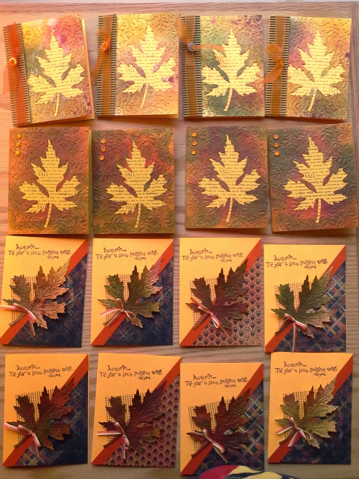
Last weekend Tim Holtz's BigZ Leaf Die and Texture Fades Embossing Folder arrived in my mailbox, just in time for the fall cards I like to send to my family and friends.  When Simon Says Stamp's Wednesday blog challenger arrived in my mailbox, just in time for the fall cards I like to send to my family and friends.  When Simon Says Stamp's Wednesday blog challenge was to use watercolor this week, including Distress, I jumped at the chance.  So I sat down to make a few cards.  Well, a few more than a few!  When I got started, I couldn't seem to quit until 1 AM.  Of all the leaf dies, this one has become my favorite one.  It is so fun to see what my scribbles on the paper reveal when the leaf is die cut.  Each one, like in nature, is different.

I quartered two pieces of cardstock, one sort of orangey-gold, the other ivory, and then proceeded to color them randomly with Distress stains.  The darker cardstock I used the Distress daubers and applied random squiggles and dots with Festive Berries, Crushed Olive, Spiced Marmalade, and Wild Honey.  The ivory cardstock received only a spritz of Distress stains mixed with water, using the following colors:  Fired Brick, Forest Moss, and Mustard Seed.  While I was spritzing, I also spritzed a little on the first batch.  I wasn't impressed with the first batch until I die cut the leaves.  Wow.  What an amazing thing!  These leaves resemble turning leaves more than any I have ever made!  And the negative space that is left demanded to be used on a card as well!  The second batch was just about perfect to me!

So I took another Tim Holtz Texture Fades with small leaves on it and ran that negative space through my Vagabond.  After all the embossing was finished,  I applied Brushed Corduroy Distress Ink with the Inkssentials Blending Tool on the raised areas.  Next step, I spritzed the leaves and the negative spaces with gold spray mist to give them all a warm shimmer.  

I have an old Hero Arts stamp with fall-related words on it, so using a stamp positioner, I was able to stamp those words repeatedly on the backing card, revealing them through the hole left behind from die cutting the leaf.  I love this!  Above you can see one of each card I made with these magnificent leaves and their negative spaces.  Other items used on these cards are some corrugated cardstock rubbed with Distress ink to blend with the card, patterned paper cut on the diagonal, cardstock, ribbon, magic mesh, and orange goosebumps.

The photo below shows the results from one long evening spent in my studio!  The first row shows the negative space from the leaves that were just spritzed onto cream cardstock.  The second row was the orangey-gold cardstock with the Distress Stain Daubers and Distress spritzing.  The third and fourth rows show the various leaves obtained with both methods. 


Wednesday, October 8, 2014

Fall Color...........Coming Your Way in the Mail!

Fall Bench from Great Products

Fall is absolutely one of my favorite times of year because of nature's colors.  They are my favorites!  So I am finding myself drawn to making fall cards more than I ever used to do.  So some of my friends and family are being treated with a seasonal card before Thanksgiving and in place of a Christmas card.  Well, maybe. 

The new wafer-thin dies are incredible, and it seems that every company out there has picked up on the concept that many stampers dislike cutting out with scissors and craft knives!  Personally, I would love to buy a die for every stamp I own!  The new Impression Obsession leaf and rake, the  Impression Obsession pumpkin die, and the Impression Obsession apple basket dies for fall are so cute, and they go perfectly well with the Elizabeth Craft Designs Garden Bench that has become my favorite Karen Burniston Pop It Up die by far.  It is so versatile, and I have all these ideas floating around in my head for it.  The tree in the background is another Elizabeth Craft Designs wafer-thin die, All Seasons Tree.

This card is the one I mentioned in my previous post.  And I am submitting it to Simon Says Stamp's Monday Challenge whis is to be a fall-themed card--"Falling in Love With...".

I love how the Elizabeth Craft Design Pop It Ups dies allow the resulting card to be bigger than normal.  This gives so much room to make a scene.  I love little scenes in my cards.  So do my little granddaughters.  I tend to design with them in mind.  If a child loves it, than an adult will, too!

I used the great Crescent Moon and Stars die by Tim Holtz and Sizzix  in the background.  I love its large size, and if you have been watching the moon lately, you realize that a harvest moon sometimes looks bigger than normal.  I love that this die lends itself to this "harvest moon" concept, even though it is crescent-shaped instead of a full moon.  Love the "man in the moon" face on this die!  I kept thinking of the old song, "Shine On Harvest Moon" as I was making this card, and the music paper was the perfect touch to carry out that theme.  The "rug" in front of the garden bench is patterned paper (which I also used on the front of the card--this paper is double sided, which is great for these cards).   It is embossed with a Sizzix embossing folder from the Textured Impressions Foyer set, which you can see on sale now HERE.  I then just cut around the embossed shape to give me a sentiment and an accent in front of the bench.

Watch for more fall-themed cards in tomorrow's blog.  I am on a roll!


Tuesday, October 7, 2014

Halloween Mantelpiece with Elizabeth Craft Design Dies!


Recently I have been brainstorming to share some projects with a small retreat gathering at the end of this month using Elizabeth Craft Design Pop It Ups designed by Karen Burniston.  Simon Says Stamp has a fall-themed challenge this week, too, so this will be an entry there as well!  There is so much potential with these wonderful wafer-thin dies.  No size limits here, either!  So making a fun scene inside a card has few restraints.  Some of the manipulations that are available by the way the dies are positioned and cut make them very versatile, and it makes my head spin to think of ways to decorate these wonderful cards and decorative projects.  These are called triple pivot cards made with all of the Elizabeth Craft Design's pivot dies designed also by Karen, double Lorna Label platforms, etc.  Check out some of Karen Burniston's YouTube videos for ideas and instructions for these amazing adaptations to her dies.
Close up of first few panels

This decorative project for the mantel is all ready to delight my grandchildren with its spooky silhouette stamps from Tim Holtz's Stampers Anonymous stamps.  I used stamps in three different sets from a couple of years ago.  There are many sets in Tim's collection that can be used with this project.  The mantelpiece is adaptable to any size mantel.  I chose to use eight panels for this one since I could get eight panels from two sheets of 12 x 12 double-sided cardstock.  Rather than try to give you written instructions for assembling an accordion album, I have included the link to Karen Burniston's YouTube video.  She tells you all you need to know about the basics of assembly in her videos.

To reinforce the panels, it is advisable to cut panels out of a heavy cardstock and trim off the center portions, leaving only the exterior frame.  Attach the frame to the back of the panel with tape runner or a fast-drying glue.  This frame can be made from a heavy cardstock or my favorite--hot pressed 140 lb. studio watercolor paper in a pad.  I love this for stamping images to color with Copics, too, so I keep a supply on hand.  My favorite brand for this is Fabriano.  These frames can be left white or colored as you wish with Distress inks or spray them with ink spray and let it dry before you cut them.

After all your panels are cut and reinforced, stamp your images onto white cardstock and cut with one of the decorative panels that will fit onto the center area containing the movement mechanism.  Mine have three smaller panels matted with the largest one in my color choices and the remainder are not matted.  Some of the stamped images will be too big for the panels, but that's okay.  The open style of these wafer-thin dies will allow optimum placement of the die on the stamped image.  the parts that are cropped away will not be missed.  The brain automatically ignores things with only a small visual suggestion--re: the ends of the branch the owl is sitting on, the tip of the cat's tail and the bat wing, or the bristles on the end of the broom   I know, you are now looking at the close-ups to see what I didn't fit into the panels, aren't you?
Close-up of middle portion of mantelpiece


Next step:  using Tim Holtz's Distress Inks and his foam applicator tool, color the backgrounds of the stamped images as desired.  For the moon in some of my images, I punched a 3/4" circle from the sticky part of a post-it note to make a mask.  I then placed the mask where I wanted the yellow moon and sponged the purple Seedless Preserve Distress ink all over the image.  Then remove the mask and distress the moon with the golden Wild Honey Distress ink.  Hint:  use the remainder of the post-it note over the area (with the circle centered over the moon)  to keep the purple sky area free from the ink you use to color the moon.  Next decorate your album panels with the stamped pieces and mats.  Embellish these images with googly eyes, colored gems, buttons, glitter, foam ghosts, and whatever appropriate embellies you may have in your stash.  Finally, assemble the album as seen in the video.  (Click  here on YouTube to go see it again!)

The Trick or Treat title at the top of the piece shown in the close-up above is stamped and cut out with a Tim Holtz's Sizzix die.  Then it is sponged with Wild Honey Distress behind the title and edged with Seedless Preserves Distress ink.  To mount it on top of the album while displaying it, I used two of the larger discarded pieces cut from areas of the panel cards.  I glued two parenthesis-looking pieces together to make them stronger (make two of these), folded them in half, and attached them to the back of the title. To make the title sit on top, merely spread apart the "legs" and have them straddle the card as shown in the close-up above.  Later it can be removed and the entire mantelpiece can be stored safely in a closed position.
Close-up of last few panels


We plan to make a similar project at our gathering, except we will do one with a Christmas/Winter theme. Watch for a blog on this next project a little closer to winter.


Another project we plan to do at the retreat is a fall card that will be appropriate for harvest time or Thanksgiving, using Elizabeth Craft Design's Garden Bench.  You have already seen one card made with the bench on this blog, so I want to show the versatility of this amazing die.  This will be the subject of my next blog.


Thursday, September 25, 2014

More Painting with BLACK INK Papers!


Lotus

Since the summer of 1985 we have had a small water garden next to our patio.  Recently it has been neglected, however the Mrs. Perry D. Slocum Empyreal Lotus (not a typo--that was its name from the supplier) in my garden remains healthy.  And in fact, it has taken over the pond, as it will do in any body of still water.  The growing season for lotus begins with a few leaves floating on top of the water.  As warm weather ensues, the leaves begin to shoot above the surface of the water and open like a big umbrella.  Then, in June, the flower buds rise above the umbrella leaves and begin to open.  The first day, they are at their most vibrant color--a peach striated bloom.  Each successive day, the bloom changes in color and seems larger, until it is dinner plate size.  And the day before losing its petals, the blossom is pale yellow with very few peach striations in the petals.  But this plant isn't finished yet.  As it matures, it reveals a small greenish pod in the center, and after the petals fall, it continues to mature into the typical brown lotus pod you see in floral arrangements, with big brownish seeds in the holes.  Then they begin to lose their seeds, and the pods become fodder for floral arrangers.

So in the past, I have recreated Mrs. Perry D. Slocum in watercolor, oil, and an etched zinc plate, which led to many signed and numbered hand-pulled prints back in the early 1990's.  Now she is displayed in my latest creation in 3-D constructed with Black Ink handmade papers from Graphic Products Corporation.

Thanks go out to Beth Grubb, the amazing artist who introduced me to Black Ink papers last year when I got my fingers all messy with Mod Podge and those wonderful papers and made some art with them!  She inspired me to again do a floral piece.  She had a class last weekend at our local PlazaArt store, and she brought in some of Black Ink's newest papers.  These papers jumped out at me and screamed "Lotus in a pond!!!"  So we were given a square canvas, upon which I began the re-creation of a lotus blossom.  I would have loved to show the umbrella-like blooms floating above the water, but it would have had to be displayed lying on a table, not hanging on a wall!  So instead, I applied a portion of a leaf three times around the edges, giving the illusion of 3-D leaves.

Add caption

Side View Showing Leaves on Canvas Edges
The new papers are so luscious.  Tools needed for this project were a pair of scissors, a jar of Mod Podge, and a disposable foam brush.  Each piece going onto the canvas is covered on top and bottom with the Mod Podge and carefully placed and shaped as it dries.  This was the method used to suggest the shapes of the leaves, the stem, and the petals.   As I added the final petals to the bloom, I used a bamboo skewer to coax them into shape.  The canvas is covered and wrapped in one of the new papers that suggested water to me.  I love the turquoise, yellow and greens in this paper.  Two different kinds of green papers represent the lotus pads floating on the water.The blue and purple papers under the blossom are glued flat to represent a shadow on the water.  The papers used for the blossom are from the same style of papers as the water. To create the bloom, I used two of the available papers in this style with the colors of orange and yellow on one and pink and orange on the other.  All papers are highlighted with a metallic gold or silver.  This inclusion really adds depth to the papers AND the project!

The center of the lotus depicts the pod with some of the papers folded and crinkled to build up the center so the pod has a little height to it.  The top of the pod is made from a piece of packing paper that was scored to make it similar to honeycomb. 
HONEYCOMB PACKING MATERIAL
 This paper reminded me of the lotus pod, so I cut a piece and glued it on top, keeping the openings a little flexible so I could glue pearlized beads into them.  The beads represent the seeds in the pod.  To imitate stamens around the pod, I used some eyelash yarn from my stash.  I have decided I like this lotus art better than any done in previous years!  Now I need to create two more close-up flower blooms so I can create a pleasing arrangement of canvases on a wall!  So what's next?  I am thinking a magnolia (since there are so many here in the South); and an iris, our state flower in Tennessee, will make nice additions to the lotus and the sunflower shown in a previous post here on the blog.

Close-up of Pod


Saturday, August 30, 2014

More Cards from Elizabeth Craft Design Dies!


Front of the Garden Bench Die Card


There is no end to the possibilities of cards and projects one can make using Karen Burniston's Pop-It Up dies from Elizabeth Craft Designs.  She is on a roll!  And as a pop-up card lover, I am delighted.  Now if someone would also design some sentiments for these dies, it would make it a lot easier on me!  I search and search for the perfect thing to say on a card.  I had to resort to the internet to find something for this one.  I think it works okay, and thank goodness I have a computer that I can use to print what I want to say.

This little garden bench die is rapidly becoming my favorite die.  I keep thinking of fun things to do with it.  And so do my friends! Ann Cumbie plans to make a Halloween bench, complete with a spooky street lamp behind the bench.  I have some ideas for Halloween, too, and I will post when I get one made.  In the meantime, here is a great one for your friends who are gung-ho exercisers.

Inside of Garden Bench card

I love the little accessory die that is the tree behind the bench.  It can be so versatile--with or without leaves and flowers, and it can be used for any season.  Plus, the shapes that make us the leafy sections can also be used for clouds.  Woodgrain embossed paper makes a great bench, too.  I used white woodgrain paper here.  

The paved section under the bench is from an old stash of paper from Club Scrap.  The grass-printed paper is also from my stash of paper, and I think it probably came from Michael's long ago.  I hope it is still being printed, since I plan on searching for more.  It works great on pop-up cards that need to be little scenes.

Triple Pivot Butterfly Card


Above is my interpretation of Karen Burniston's Triple Pivot Card. Why make a simple pivot card when you can do a special manipulation with the pivot card die and make a triple pivot card?  It is far more interesting.  Of course, it is also very labor intensive, so I recommend once you have this technique mastered, make several cards at a time, using assembly line methods.  Each step will get easier if you do it this way.  Plus it will really groove the technique into your brain so you won't have to re-run the YouTube video again and again like I did!  And here is the inside of the card:


Thank you, Karen Burniston, for all your inspiration using Elizabeth Craft Design dies and other products!

Tuesday, August 26, 2014

Art Journaling for ME?


Entire Cover of the Documented Life Project Art Journal

I have often thought of doing an art journal.  I even read a book about doing one and the positive influence it can be in your artistic life.  But, frankly, I didn't know where to begin.  By just experimenting on each page, it bares your soul to whoever is looking at it, and I just didn't feel comfortable doing that.  I guess my mother's voice will always be in the back of my mind as she laughs at a portrait I painted  of my brother--my first attempt at one (when I was 19), and as I look back at the one photo I have of it, I see that I didn't do a bad job--in fact, it actually looked like him!  She was just highly critical of everything, and somehow I cannot free myself of the feeling that I have never quite made it as an artist.  But the critical side of me is beginning to be overshadowed by my right brain's non-logical way of thinking.  I AM an artist!  And I am beginning to be proud of whatever I do...whether it pleases others or not.  Maybe that is due to my age, but who knows?  I have also come to the realization that it is the process of creating that pleases me when I finish.  It is the actual doing of it that is most important...not the finished product!

Although I am late coming to the table, I joined Documented Life Project, an art journal journey that presents a challenge each week to participants.  It is up to us how to interpret that challenge and convert it to art in our Moleskine Daily Journal.  A friend of mine, who was also interested in jumping on board, found a Moleskine Daily Journal that was an 18-month one, beginning with the first week of July 2014.  So we ordered them and started our art journal journey.  I did the first week of mine, and then decided to go ahead and do the cover and all the tip-in pages, which are mostly watercolor paper added to the second page of each week with Washi tapes of all colors and prints.  

Frankly, I am quite proud of the cover.  I began with gesso on the leather cover...oh, how I hated to cover that leather!  But as I got into stamping, adding Jacquard's Lumiere paint with a stencil, doodling, adding Tim Holtz's tissue paper, and then coating it all with Golden matte medium and allowed to dry for 24 hours or more.  I then hand-rubbed a coat of Judikins' Microglaze to protect it from moisture and soil and then buffed it to a soft shine with a paper towel.  I have since covered it with plastic sleeves to protect it as I journal along this next year, since I am very messy at times.  I am not fond of art products on my fingers, so this is a challenge to me.  I find myself peeling off matte medium all day after working with it. Where does it all come from?  I am convinced my fingers are manufacturing it.

Washi tape Edges 
So here is the book standing up on its bottom edge, showcasing all the pretty washi taped edges where the tip-in pages are taped to the book.  Yes, this book is going to be a "fat book" when it is all finished.  That adds to its charm, in my opinion!

I might add that each page of the Moleskine is first coated with a light coat of gesso.  That helps to protect whatever medium you are using from bleeding through to the back of the page, which is the first page of your next layout!  We were instructed to add monthly tabs to the top of the book, too.  I used the wonderful rounded tab punch made by Stampin' Up several years ago.  I wish they had never retired that punch.  It makes a very cute and sturdy tab.  These tabs are all laminated, too, since they will get lots of use.

With all the amazing art supplies and techniques I have learned through the years, and also some I learned in Jean Parker's Mixed Media classes at PlazaArts in Nashville, Tennessee, I am having fun with this art journal.  Thank you, Jean!  And thank you to my journaling friends--Ann, Boo, Kathie, Robin, Lori, andTeresa--for encouraging me to do this project.

So our first week in July's challenge was to use a crossword, sudoku, word search, or another puzzle on your layout.  I chose a crossword, since I actually do solve one every day at lunch.  But on this layout I also wanted to give a nod to our country's birthday and one of my favorite holidays, the Fourth of July!

Add a Puzzle Challenge page

This page incorporates a couple of paper napkin layers...the watermelon and the large black dots.  In Jean's classes, we always bring decorative paper napkins to swap.  Mixed media artists love all things paper that can be glued to projects, and paper napkins spark many creative endeavors.  Some of the pages have the days of the week with the date of the month showing.  I choose to either write over mine or cover them with paint, depending on how much I actually want to journal on that week.  Some people emphasize those days and journal them faithfully.  I try to add a few things that will spark memories as I look back over the past weeks of 2014.

I will show you one more layout, and then I will stop this Art Journal journey for today.  This next one shows the challenge of incorporating an Instagram or a small photo into your layout.  I chose photos of sunflowers from our garden, since they are in full bloom right now, and just looking out at them nodding their heavy seedheads with little goldfinches clinging to every one of them is a heart-warming picture to me.  I love those big, cheerful blooms topped with the cute little hungry birds!


Small Photo Layout with the tip-in page in closed position


Small photo layout open

This layout has lots of layers of Golden fluid acrylics, a grass die cut, Washi tape, a sun ray stencil from Tim Holtz, a sunflower stamp stamped with a stamp pad made especially for it and then cut out and glued on with matte medium,  more pen doodling, and the cross-hatching, which is kind of making an appearance on all my pages.  It is done with a piece of corrugated cardboard and gesso applied haphazardly to the ridges with my finger, then pressed down on the pages horizontally and then at right angles to the first stamped area.  Then it was slightly shaded with a black pen to give a little depth to the cross-hatching.

I will continue working in my art journal, but I won't share every little detail with you.  There are other art things happening in my life, and I will share a little bit of these things the next time I blog!


Friday, July 18, 2014

Paint with Paper!

The direction of my journey in art changed after a class at PlazaArt in Nashville, Tennessee with Beth Grubb, an amazing artist who uses interesting handmade papers to create gorgeous works of art.  For a year now, I have been trying to come up with a large "something" to go above the headboard of our bed.  Nothing came to me until after taking Beth's class!  The free child in me was unleashed.  You may also see these creations  on the Graphic Products Facebook page here (the sunflower is there now).

Working with Black Ink fine art papers, we tore, cut, Mod Podged, and designed works of art.  In this class, a small canvas was covered with the papers, some cardstock, and a little gold paint.  One of the papers I chose had some string that pulled out of the paper easily, adding another collage element to the design.  Our guest room, now mostly used by two little granddaughters, had recently been painted and redecorated in purples and a touch of muted teal.  So this canvas became inspiration to do three different ones with similar abstract qualities.  A decorative pillow (see photo below) gave me an idea to tie these elements together, since it had the word "SMILE" on it.  


I added die cut letters to each canvas to carry out the theme--Grin, Giggle, Laugh, --all things little girls do without restraint. 


What fun it was to create something for the sheer pleasure of combining textures and colors to make something pleasing to the eye.  Here are the three canvases a little bigger so you can see the incredible Black Ink papers a little bit better.


The Giggle painting (above)  is shown smaller than the two square ones that surround it in the wall arrangement.  It is actually larger than Grin and Laugh, but making it larger here made it lose the edges, so I kept it smaller.  The textures in all three are very similar.


Back to the class:
The class lasted long enough to design a second canvas and even a third one.  So I played around with a more graphic look inspired by some more of Black Ink's wonderful papers.  Here is the result of that second experiment.
Thanks to the generosity of Black Ink, Beth let us pick and choose extra papers from the class to take home and make more magic, so I did the third canvas at home ("Laugh" shown above).  There was enough paper left to do another graphic canvas similar to the one to the left with the gold leaves.  I used music images on another one for my daughter's newly decorated entertainment room.

It was during this class that the long awaited inspiration for the other bedroom wall was born.  Each year our garden yields massive amounts of sunflowers.  Only planted in rows for two years, they freely have scattered seed, with help from the goldfinches and other feathered sunflower connoisseurs.  My husband takes care to keep many seedlings growing inside other garden produce rows just for the sheer enjoyment they give us.  Sometimes I think they are more important than the food we grow.  They are food for the spirit!  And my idea is born!  A giant sunflower on a big square canvas, using these wonderful papers and maybe some other media has become my goal.  

Beth was excited to hear about the Tennessee Stampers' Annual Retreat after several of us had "played" in her class, and she agreed to come and teach her unique techniques to the rest of the group.  We were so lucky to have her there, and she inspired many others to branch out and add handmade papers to our projects (now those of us who have stamped for years already love our paper!) .  So I decided ahead of time to begin to plan the long-awaited project for the master bedroom wall by producing a miniature version...just to work out any kinks or problems I may have trying to achieve my goal.  I loved how it began to look as I was gluing and cutting and tearing leaves and petals.  I used a piece of paper that had a very textural reptilian hide look to it for the big center, cutting it out with a large round scalloped die.  It was mounted on chipboard before cutting, then it was elevated off the canvas with some heavy-bodied E-6000 craft glue.

I was unsatisfied with the center of the sunflower, although it was pretty fine as it was. It just needed more.  It needed to have beads added to make the center resemble the seed head in its immature state.  Besides, I just love a little "bling!"  After a couple of weeks studying this canvas, I decided to work on the center.  So using Ranger's Glossy Accents, I built up the outer edge with a variety of added textural products, including larger amber colored clear beads and some other glittery additives to resemble the stamens on the outer edge of the sunflower's center and then added more of the Glossy Accents to the center after the edge was nearly dry. On the center, I poured a generous helping of little tiny black glass beads from my stash of beads that have been in my craft room from my early teaching days.  After these were nearly dry, more Glossy Accents and black beads helped to raise the edge of the black area to resemble a sunflower.  Success!  Now, the challenge will be trying to figure out what to use on a canvas three times the size of this one! 

THE FINISHED SUNFLOWER STUDY


Thursday, June 19, 2014

Loving Karen Burniston's New Dies at Elizabeth Craft Design!

Since the first pop-up card I received for a childhood birthday, I have been crazy about anything that moves, pops-up, surprises me, and makes me smile when I open a card or a pop-up book.  


When I began scrapbooking, I engineered my own pop-up pages, but I admit, there was a lot of trial and error before figuring out how to make something pop up on a layout. Karen and Sizzix made this stuff all possible for card-making....but I find they can be used in scrapbooks and altered books, too!


Here are three of my feeble little attempts back in 1999 and 2000 before pop-ups were being used in scrapbooks.  Don't laugh at all the photos on the pages...I learned better design as I studied and experimented while exploring this area of art that was so new!  (At least it was new to me!)


This page is from a Christmas album.  The house is a replica of a dollhouse we made for our daughter one Christmas.


The page with the Christmas tree pop-up is from the same album that spans the first 30 years of family Christmases.

This page (above) is the first pop-up page I ever did.  It won an award at a local scrapbook store, too!  I actually used photographs of the football stadium to have the pop-up look like a real stadium during a football game.  This was fun to splice the photos so they lined up perfectly.  As you can see, these pop-ups were very limited by my lack of knowledge and good tools!


...and now, back to more about the great tools from ECraft Design and Karen Burniston's fantastic dies:


When Karen Burniston began designing pop-up cards for Sizzix, I was so amazed and happy that someone finally designed dies that would do that.  Now Karen has joined forces with ELS VAN DE BURGT at Elizabeth Craft Designs.  I am simply crazy about the garden bench, and all the others she has designed. The dies are the wafer thin ones, not limited to a certain card size, since you choose whatever size you wish to cut the design into.  Also, I admit that I am delighted with the new magnetic platform Sizzix has manufactured, making these and other similar dies easy to cut, and it is a cinch to center patterns or stamped images inside the dies.  I like the way Elizabeth Craft Designs has put so many dies into a set!  Most of the time there are dies for the card itself plus embellishment dies to match--all in one great set.


I recently decided to invest in a few of the accordion album/card designs.  These are so versatile!  From only two pages to as many as you wish to add, the dies enable us to make a card for a friend or an album with photos for our family.  Coupled with ECD's Peel Off Stickers and/or Shimmer Sheetz, their ultra fine glitter in Warm or Cool Diamond, a little coloring with Copic markers, and you have a card that is really beautiful and different from the cards I have made for years.  I am enjoying the variety of choices.  There just isn't enough time to make all that is running through my head now!


Here is a sample of one, both front and back, and closeups of a couple of the panels using the peel-off stickers, positive and negative of the designs, using Els' fantastic how-to directions on video:


There will be more to come in the near future.  So be sure to check back soon for a sample of Karen's amazing triple flip-it card!  The link to her YouTube video demonstrating her triple flip-it card is here.

Wednesday, April 30, 2014

Easy Oatmeal Cake with Broiled Coconut-Pecan Frosting!


After a long break from posting to my blog, I am back with a recipe that is sure to please a small family! This makes a small 9 x 9 inch cake, perfect for a last minute dessert tonight after supper!  I serve it hot, so after broiling the frosting wait about 10-15 minutes to make it easier to serve, if you can wait that long.

Easy Oatmeal Cake with Broiled Coconut-Pecan Frosting

Oatmeal Cake with Broiled Frosting

1/2 c quick cooking oatmeal
3/4 c boiling water
1/2 c sugar
1/2 c brown sugar
 2/3 c flour
1/2 tsp salt
1/2 tsp baking soda
1 egg
1/4 cup shortening

Mix oatmeal with boiling water, stir, and cover for a few minutes.  Stir in shortening while it is still hot.  Mix remaining ingredients stir in oatmeal mixture. Grease & flour 9×9 pan. Pour batter into pan bake 350° for 23-25 minutes.

Frosting:

3 T melted butter
1/3 c brown sugar
1/2 c sweetened shredded coconut
1/2 c chopped nuts
 2 T milk
1/2 tsp vanilla

Combine ingredients. Carefully spread frosting on hot cake, place under broiler for 5 or more minutes, watching carefully, until the coconut begins to brown.  Watch carefully, or you will burn the frosting.  Cool and serve.  Makes 9 servings.