 |
| Use both Positive and Negative Space from Die Cutting!
Last weekend Tim Holtz's BigZ Leaf Die and Texture Fades Embossing Folder arrived in my mailbox, just in time for the fall cards I like to send to my family and friends. When Simon Says Stamp's Wednesday blog challenger arrived in my mailbox, just in time for the fall cards I like to send to my family and friends. When Simon Says Stamp's Wednesday blog challenge was to use watercolor this week, including Distress, I jumped at the chance. So I sat down to make a few cards. Well, a few more than a few! When I got started, I couldn't seem to quit until 1 AM. Of all the leaf dies, this one has become my favorite one. It is so fun to see what my scribbles on the paper reveal when the leaf is die cut. Each one, like in nature, is different.
I quartered two pieces of cardstock, one sort of orangey-gold, the other ivory, and then proceeded to color them randomly with Distress stains. The darker cardstock I used the Distress daubers and applied random squiggles and dots with Festive Berries, Crushed Olive, Spiced Marmalade, and Wild Honey. The ivory cardstock received only a spritz of Distress stains mixed with water, using the following colors: Fired Brick, Forest Moss, and Mustard Seed. While I was spritzing, I also spritzed a little on the first batch. I wasn't impressed with the first batch until I die cut the leaves. Wow. What an amazing thing! These leaves resemble turning leaves more than any I have ever made! And the negative space that is left demanded to be used on a card as well! The second batch was just about perfect to me!
So I took another Tim Holtz Texture Fades with small leaves on it and ran that negative space through my Vagabond. After all the embossing was finished, I applied Brushed Corduroy Distress Ink with the Inkssentials Blending Tool on the raised areas. Next step, I spritzed the leaves and the negative spaces with gold spray mist to give them all a warm shimmer.
I have an old Hero Arts stamp with fall-related words on it, so using a stamp positioner, I was able to stamp those words repeatedly on the backing card, revealing them through the hole left behind from die cutting the leaf. I love this! Above you can see one of each card I made with these magnificent leaves and their negative spaces. Other items used on these cards are some corrugated cardstock rubbed with Distress ink to blend with the card, patterned paper cut on the diagonal, cardstock, ribbon, magic mesh, and orange goosebumps.
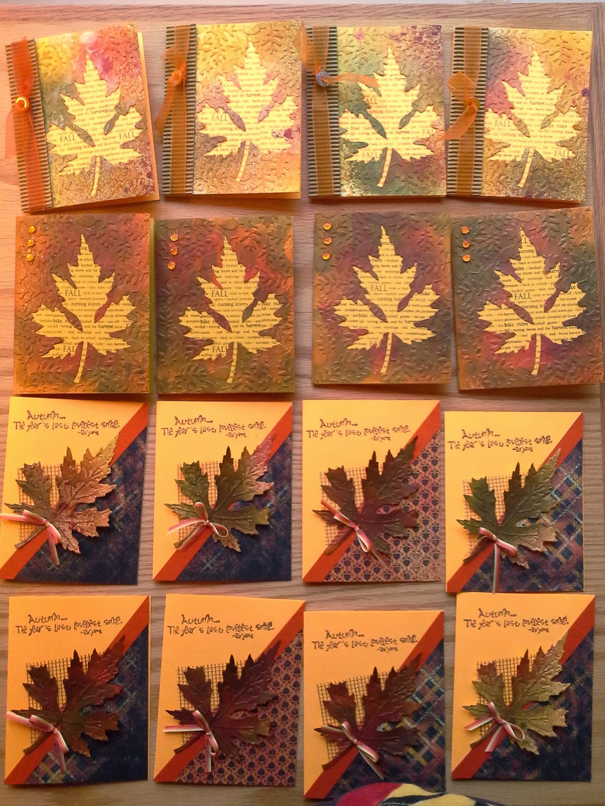
The photo below shows the results from one long evening spent in my studio! The first row shows the negative space from the leaves that were just spritzed onto cream cardstock. The second row was the orangey-gold cardstock with the Distress Stain Daubers and Distress spritzing. The third and fourth rows show the various leaves obtained with both methods.
 |
Thursday, October 9, 2014
More Fall Cards with Distress!


Wednesday, October 8, 2014
Fall Color...........Coming Your Way in the Mail!
 |
| Fall Bench from Great Products
Fall is absolutely one of my favorite times of year because of nature's colors. They are my favorites! So I am finding myself drawn to making fall cards more than I ever used to do. So some of my friends and family are being treated with a seasonal card before Thanksgiving and in place of a Christmas card. Well, maybe.
The new wafer-thin dies are incredible, and it seems that every company out there has picked up on the concept that many stampers dislike cutting out with scissors and craft knives! Personally, I would love to buy a die for every stamp I own! The new Impression Obsession leaf and rake, the Impression Obsession pumpkin die, and the Impression Obsession apple basket dies for fall are so cute, and they go perfectly well with the Elizabeth Craft Designs Garden Bench that has become my favorite Karen Burniston Pop It Up die by far. It is so versatile, and I have all these ideas floating around in my head for it. The tree in the background is another Elizabeth Craft Designs wafer-thin die, All Seasons Tree.
This card is the one I mentioned in my previous post. And I am submitting it to Simon Says Stamp's Monday Challenge whis is to be a fall-themed card--"Falling in Love With...".
I love how the Elizabeth Craft Design Pop It Ups dies allow the resulting card to be bigger than normal. This gives so much room to make a scene. I love little scenes in my cards. So do my little granddaughters. I tend to design with them in mind. If a child loves it, than an adult will, too!
I used the great Crescent Moon and Stars die by Tim Holtz and Sizzix in the background. I love its large size, and if you have been watching the moon lately, you realize that a harvest moon sometimes looks bigger than normal. I love that this die lends itself to this "harvest moon" concept, even though it is crescent-shaped instead of a full moon. Love the "man in the moon" face on this die! I kept thinking of the old song, "Shine On Harvest Moon" as I was making this card, and the music paper was the perfect touch to carry out that theme. The "rug" in front of the garden bench is patterned paper (which I also used on the front of the card--this paper is double sided, which is great for these cards). It is embossed with a Sizzix embossing folder from the Textured Impressions Foyer set, which you can see on sale now HERE. I then just cut around the embossed shape to give me a sentiment and an accent in front of the bench.
Watch for more fall-themed cards in tomorrow's blog. I am on a roll! |
Tuesday, October 7, 2014
Halloween Mantelpiece with Elizabeth Craft Design Dies!

Recently I have been brainstorming to share some projects with a small retreat gathering at the end of this month using Elizabeth Craft Design Pop It Ups designed by Karen Burniston. Simon Says Stamp has a fall-themed challenge this week, too, so this will be an entry there as well! There is so much potential with these wonderful wafer-thin dies. No size limits here, either! So making a fun scene inside a card has few restraints. Some of the manipulations that are available by the way the dies are positioned and cut make them very versatile, and it makes my head spin to think of ways to decorate these wonderful cards and decorative projects. These are called triple pivot cards made with all of the Elizabeth Craft Design's pivot dies designed also by Karen, double Lorna Label platforms, etc. Check out some of Karen Burniston's YouTube videos for ideas and instructions for these amazing adaptations to her dies.
 |
| Close up of first few panels |
This decorative project for the mantel is all ready to delight my grandchildren with its spooky silhouette stamps from Tim Holtz's Stampers Anonymous stamps. I used stamps in three different sets from a couple of years ago. There are many sets in Tim's collection that can be used with this project. The mantelpiece is adaptable to any size mantel. I chose to use eight panels for this one since I could get eight panels from two sheets of 12 x 12 double-sided cardstock. Rather than try to give you written instructions for assembling an accordion album, I have included the link to Karen Burniston's YouTube video. She tells you all you need to know about the basics of assembly in her videos.
To reinforce the panels, it is advisable to cut panels out of a heavy cardstock and trim off the center portions, leaving only the exterior frame. Attach the frame to the back of the panel with tape runner or a fast-drying glue. This frame can be made from a heavy cardstock or my favorite--hot pressed 140 lb. studio watercolor paper in a pad. I love this for stamping images to color with Copics, too, so I keep a supply on hand. My favorite brand for this is Fabriano. These frames can be left white or colored as you wish with Distress inks or spray them with ink spray and let it dry before you cut them.
After all your panels are cut and reinforced, stamp your images onto white cardstock and cut with one of the decorative panels that will fit onto the center area containing the movement mechanism. Mine have three smaller panels matted with the largest one in my color choices and the remainder are not matted. Some of the stamped images will be too big for the panels, but that's okay. The open style of these wafer-thin dies will allow optimum placement of the die on the stamped image. the parts that are cropped away will not be missed. The brain automatically ignores things with only a small visual suggestion--re: the ends of the branch the owl is sitting on, the tip of the cat's tail and the bat wing, or the bristles on the end of the broom I know, you are now looking at the close-ups to see what I didn't fit into the panels, aren't you?
 |
| Close-up of middle portion of mantelpiece |
Next step: using Tim Holtz's Distress Inks and his foam applicator tool, color the backgrounds of the stamped images as desired. For the moon in some of my images, I punched a 3/4" circle from the sticky part of a post-it note to make a mask. I then placed the mask where I wanted the yellow moon and sponged the purple Seedless Preserve Distress ink all over the image. Then remove the mask and distress the moon with the golden Wild Honey Distress ink. Hint: use the remainder of the post-it note over the area (with the circle centered over the moon) to keep the purple sky area free from the ink you use to color the moon. Next decorate your album panels with the stamped pieces and mats. Embellish these images with googly eyes, colored gems, buttons, glitter, foam ghosts, and whatever appropriate embellies you may have in your stash. Finally, assemble the album as seen in the video. (Click here on YouTube to go see it again!)
The Trick or Treat title at the top of the piece shown in the close-up above is stamped and cut out with a Tim Holtz's Sizzix die. Then it is sponged with Wild Honey Distress behind the title and edged with Seedless Preserves Distress ink. To mount it on top of the album while displaying it, I used two of the larger discarded pieces cut from areas of the panel cards. I glued two parenthesis-looking pieces together to make them stronger (make two of these), folded them in half, and attached them to the back of the title. To make the title sit on top, merely spread apart the "legs" and have them straddle the card as shown in the close-up above. Later it can be removed and the entire mantelpiece can be stored safely in a closed position.
 |
| Close-up of last few panels |
We plan to make a similar project at our gathering, except we will do one with a Christmas/Winter theme. Watch for a blog on this next project a little closer to winter.
Another project we plan to do at the retreat is a fall card that will be appropriate for harvest time or Thanksgiving, using Elizabeth Craft Design's Garden Bench. You have already seen one card made with the bench on this blog, so I want to show the versatility of this amazing die. This will be the subject of my next blog.
Thursday, September 25, 2014
More Painting with BLACK INK Papers!
 | ||||||||
| Lotus
Since the summer of 1985 we have had a small water garden next to our patio. Recently it has been neglected, however the Mrs. Perry D. Slocum Empyreal Lotus (not a typo--that was its name from the supplier) in my garden remains healthy. And in fact, it has taken over the pond, as it will do in any body of still water. The growing season for lotus begins with a few leaves floating on top of the water. As warm weather ensues, the leaves begin to shoot above the surface of the water and open like a big umbrella. Then, in June, the flower buds rise above the umbrella leaves and begin to open. The first day, they are at their most vibrant color--a peach striated bloom. Each successive day, the bloom changes in color and seems larger, until it is dinner plate size. And the day before losing its petals, the blossom is pale yellow with very few peach striations in the petals. But this plant isn't finished yet. As it matures, it reveals a small greenish pod in the center, and after the petals fall, it continues to mature into the typical brown lotus pod you see in floral arrangements, with big brownish seeds in the holes. Then they begin to lose their seeds, and the pods become fodder for floral arrangers.
So in the past, I have recreated Mrs. Perry D. Slocum in watercolor, oil, and an etched zinc plate, which led to many signed and numbered hand-pulled prints back in the early 1990's. Now she is displayed in my latest creation in 3-D constructed with Black Ink handmade papers from Graphic Products Corporation.
Thanks go out to Beth Grubb, the amazing artist who introduced me to Black Ink papers last year when I got my fingers all messy with Mod Podge and those wonderful papers and made some art with them! She inspired me to again do a floral piece. She had a class last weekend at our local PlazaArt store, and she brought in some of Black Ink's newest papers. These papers jumped out at me and screamed "Lotus in a pond!!!" So we were given a square canvas, upon which I began the re-creation of a lotus blossom. I would have loved to show the umbrella-like blooms floating above the water, but it would have had to be displayed lying on a table, not hanging on a wall! So instead, I applied a portion of a leaf three times around the edges, giving the illusion of 3-D leaves.
|


.jpg)
Saturday, August 30, 2014
More Cards from Elizabeth Craft Design Dies!
 |
| Front of the Garden Bench Die Card |
There is no end to the possibilities of cards and projects one can make using Karen Burniston's Pop-It Up dies from Elizabeth Craft Designs. She is on a roll! And as a pop-up card lover, I am delighted. Now if someone would also design some sentiments for these dies, it would make it a lot easier on me! I search and search for the perfect thing to say on a card. I had to resort to the internet to find something for this one. I think it works okay, and thank goodness I have a computer that I can use to print what I want to say.
This little garden bench die is rapidly becoming my favorite die. I keep thinking of fun things to do with it. And so do my friends! Ann Cumbie plans to make a Halloween bench, complete with a spooky street lamp behind the bench. I have some ideas for Halloween, too, and I will post when I get one made. In the meantime, here is a great one for your friends who are gung-ho exercisers.
 |
| Inside of Garden Bench card
I love the little accessory die that is the tree behind the bench. It can be so versatile--with or without leaves and flowers, and it can be used for any season. Plus, the shapes that make us the leafy sections can also be used for clouds. Woodgrain embossed paper makes a great bench, too. I used white woodgrain paper here.
The paved section under the bench is from an old stash of paper from Club Scrap. The grass-printed paper is also from my stash of paper, and I think it probably came from Michael's long ago. I hope it is still being printed, since I plan on searching for more. It works great on pop-up cards that need to be little scenes.
Triple Pivot Butterfly Card
Above is my interpretation of Karen Burniston's Triple Pivot Card. Why make a simple pivot card when you can do a special manipulation with the pivot card die and make a triple pivot card? It is far more interesting. Of course, it is also very labor intensive, so I recommend once you have this technique mastered, make several cards at a time, using assembly line methods. Each step will get easier if you do it this way. Plus it will really groove the technique into your brain so you won't have to re-run the YouTube video again and again like I did! And here is the inside of the card:
 |
Subscribe to:
Posts (Atom)