Two fabulous artists hosted a Christmas Lunch and Learn event this past weekend at Christine Pilkinton Studio, just in time to get us all in the mood for Christmas. I never thought about making art on canvas for Christmas, and this class has inspired me to do more! But first, I must frame the two I did from the class and hang them for the holidays!
The day began with fruit, muffins, hot tea and coffee and conversation. Then Jean Parker, an amazing mixed media teacher, directed us in making the first of our two projects for the day. We made a mixed media/collage with O Tannenbaum (the old song) as the inspiration. Jean makes it easy to become a great collage artist. She shares many insights in to what NOT to do, along with the many tips and techniques she has in her repertoire. She also brought "goodie bags" with samples and color charts and many other fun things.
Lunch was served following Jean's class. What an amazing spread it was, and we all enjoyed the festive table, set with Christmas dishes and lots of red and white decor. At lunch, Jean asked some fun art questions in exchange for our Christmas gift from them. That was a nice extra we hadn't planned on!
Following lunch, Christine Pilkinton, who hosted the event in her brightly lit studio, initiated a project of painting Christmas ball ornaments suspended on pine boughs. It was a fun project, and she showed us several examples of Christmas art for inspiration. She had a setup with ornaments lit so we could see how the reflective surfaces would look, making it easier to observe and paint. To speed the class along, we used acrylic paints because of their rapid drying characteristics. The final photo in the video is of me holding my ornament painting, and the video only lasts three and a half minutes. This well-done video (excellently photographed and put together by Christy Pilkinton) shows it all.
Monday, December 16, 2013
Friday, March 29, 2013
Easter Pop-up Cards
 |
| Bluebird Easter Card Front |
The card itself uses the same K & Company paper from a big pad--I just love all the subtle patterns and colors in this collection! The birdhouse is cut from heavy 110# cardstock with a Cricut (same cartridge was used on the birdhouses in the previous blog), and then it is embossed with a wood grain embossing folder from Sizzix for Tim Holtz, the raised areas are rubbed with Worn Lipstick Distress Ink. The bird and branch is stamped and punched with Stampin' Up's coordinating stamp and punch. The bluebird quote is from Artistic Outpost and is stamped on a Stampin' Up Apothecary label.
The great thing about this card base is that it has a nice decorative edge that tucks into slots that are cut into the corners of the back of the card. Makes a neat package! I cut another card for the inside pop-up mechanism. I used the Pop 'n Cuts Magnetic Label die insert from Karen Burniston. Yes, all the inserts for her Pop 'n Cuts are interchangeable! Imagine the possibilities!
 | |
| Bluebird Easter Card Inside |
 |
| Easter Egg Card Front |
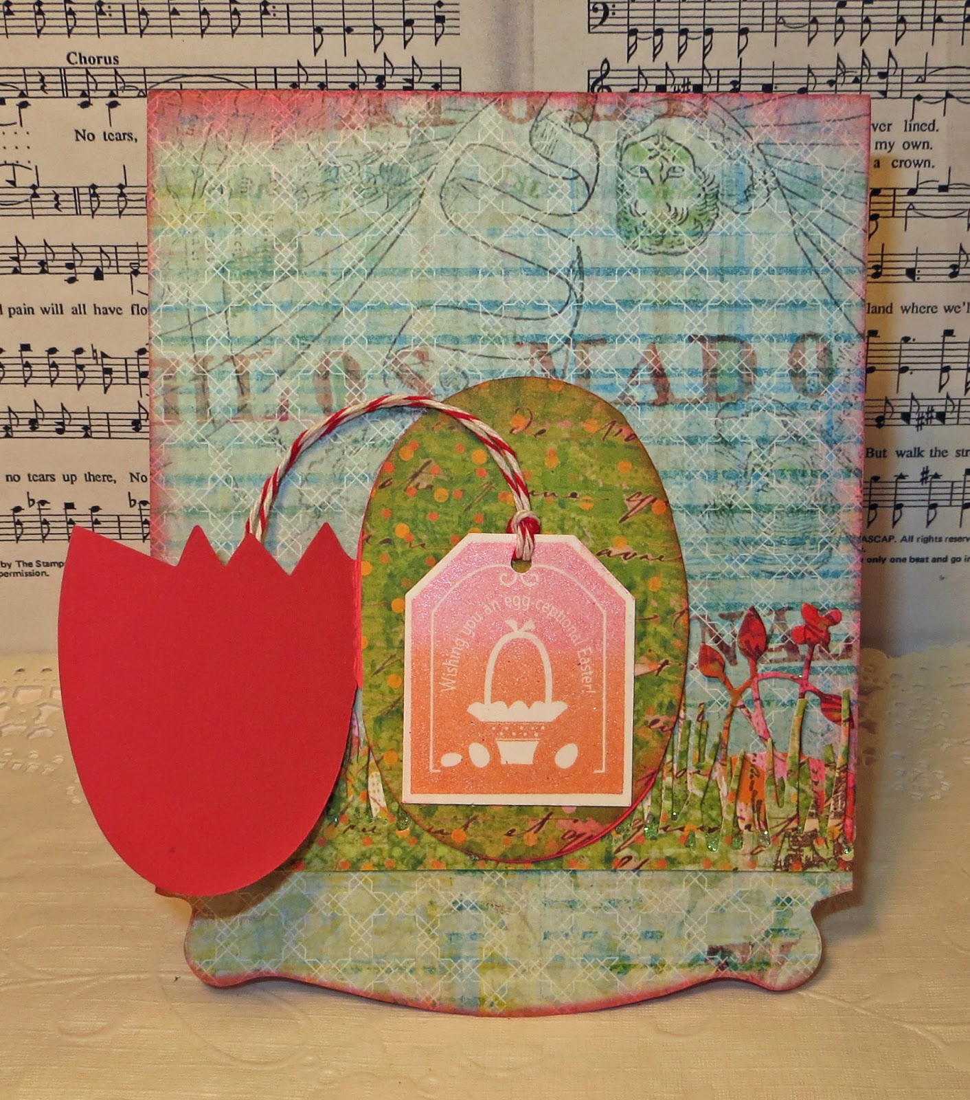 |
| Front with egg open |
The next card uses basically the same technique, except to the inside on the label pop up, I added a basket cut with an original Sizzix die and filled with little colored eggs. The front of the card has a die cut with a cracked egg original Sizzix die. It forms a little card that opens to reveal the sentiment from Stampin' UP. The flowers and grass behind the egg are by Memory Box.
 |
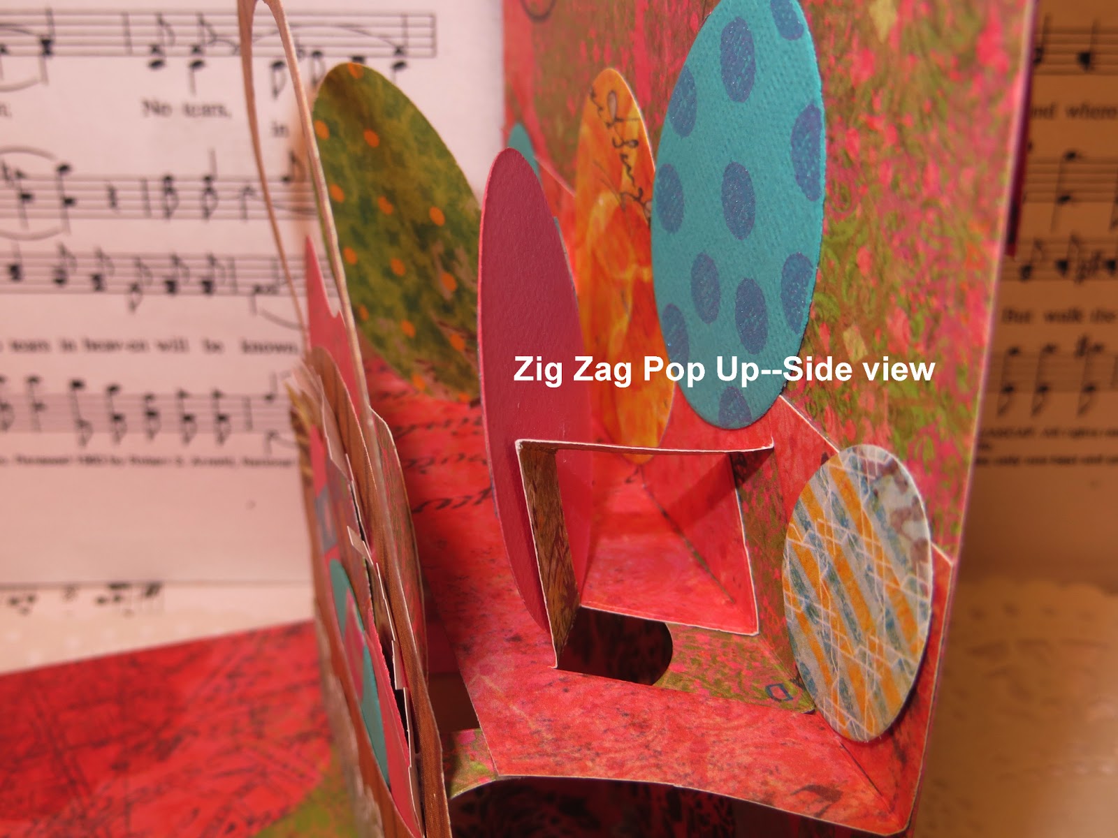
| Trimmed Zig Zag Mechanism |
After trimming the Zig Zag pop up mechanism so that it fits neatly on the platform behind the label, fold it forward, folding the little platforms along the score lines, open it back up and pop out the little platforms as shown. This is where you attach the die cut you want to pop up from behind the label.


Here are a couple of close up photos of the inside of the card with the Easter basket on the pop up label. Note the location of the platform and the Zig Zag insert mechanism installed on top of the original platform.

Saturday, March 23, 2013
For the Birds!
 | ||||
| Tip-In Pages for an Altered Book |
I used some K & Company two-sided paper from a large pad for the background and birds. The background is over-stamped with shades of Ranger Archival greens--Olive, Sap, Emerald, and Library. I wanted the background to look like it was inside a deep copse of trees, so I used a subtle stamp from Stampin' Up, used for the second step in one of the two-step stampin' floral sets. Then a leaf stamp shaped like a branch of oak leaves was stamped over all in places that makes it look like branches in the trees. The birds were cut with Sizzix's Sizzlets Decorative Strip Die, Birds on a Wire. Ranger Distress ink in Peacock Feathers and Worn Lipstick give more dimension and color to the birds. Black Soot accents the wire.
The birdhouses are cut with a Cricut and are from the cartridge Stretch Your Imagination. I used 110 pound white cardstock and covered it with Tim Holtz's Tissue Wrap that had been wadded up to wrinkle it before gluing it to the cardstock. Distress Inks applied with the foam ink applicators in Worn Lipstick, Peacock Feathers, and Shabby Shutters gives the houses some fun Spring color! The houses are perched on tree trunks cut from a Tall Birch die made by Memory Box.
The sentiment is from Artistic Outpost, stamped with Ranger Archival Ink in Manganese Blue, and it is cut with a die from the Apothecary Labels set by Stampin' Up. Worn Lipstick Distress ink is used to shade the die cut while it is still in the die. A feather is used to accent the layout.
This swap is one of the best swaps for Altered Books. The book is protected from damage since it never leaves the house, and the cost to mail the pages is only a fraction of the amount that would be charged to mail a book. I love the fact that I have control where the pages are going in my book, and that I can install them my way--with little or no warping, since I am cranky about how I glue pages into an altered book.
I don't like the warping, ripples and buckling that comes from using adhesive that is too wet. I realize sometimes it is unavoidable, but I try my best prevent it by clamping the book on the edges with waxed paper protecting other pages from accidentally being glued at the same time. My favorite glue for gluing pages together to make a sturdy foundation for a layout in an altered book is still Uhu Glue Stick. It is wet enough to grab and hold if the application is heavy and covers all areas. I always use a brayer to smooth it before gluing the next page. Immediately after gluing, I clamp the book closed with a series of large black binder clips and let the pages dry overnight.
If the book is full of embellishments and cannot be clamped, I will isolate only the section I am gluing and weight it down. You can get really creative here. I have employed my Vagabond on top of the platform that comes with the machine as a quick weight. It works pretty well. At the same time, I have propped the portion of the book I am NOT weighing down against the desk, which is higher than the chest supporting the Vagabond, so the book won't break at the spine.
If an opportunity arises for you to join a tip-in swap, give it a go! It is the best way to do an altered book swap, in my opinion!
Friday, March 15, 2013
Review--We R Memory Keepers Envelope Punch Board

Also, since I am left-handed, I wanted to speak to the 15% of you who share that characteristic! Yes, you can turn the board upside down and use it--most lefties are able to read upside down, so that isn't a problem. BUT--since 50% of us lefties work our mouse right handed (including me), I discovered I can work a bone folder right handed as well! (Some people say this will help strengthen the brain to challenge it this way!)
All of the other reviews stress accuracy in scoring and in choosing the first measurement. That is correct. Be dead-on with your measurement, punch that corner, and then score along the raised scoring edge. Turn counterclockwise and line up the marker on the punch directly in the middle of that score line.
GREAT TIP: Some people say it is hard to see the score line! True, if you are using printed paper for your envelope, but I overcame that problem by just turning the paper over so the white side is exposed!
The score line is very visible this way. Make sure the little marker (seen on the punch at the bottom left--looks like the tail of a comma, kind of) is completely centered on your first score line. Punch and score again. Turn counterclockwise, line up the marker in the center of the last score line and repeat until all four lines are scored. Then remove and round the corners at the back of the punch with the built in corner rounder--also operated with the same turquoise punch. Fold and crease with your bone folder, add adhesive and your envelope is finished! I do like to either fold an glue down the inside corner that is from the bottom flap where it sticks above the side flaps. You could also trim it off, which would be easier. Line up the side flaps (which will be on an angle) and mark the place the bottom flap crosses those lines and trim before gluing. This is optional, of course, and isn't necessary, unless you just want that particular look to your envelope!
I was a little hesitant to buy this tool, in case it didn't have the latest measurements printed on it (the first shipment had 8 errors in measurements), so I asked if mine had the latest update on it. Archiver's provided me with the correct measurements printed out on cardstock, in case it was that first version. When I got home, I checked them, and the ones on my board were correct. But it is handy to keep the extra printed chart near my paper cutter. I understand that all the boards coming out now will be correct.
As I figured, I love this new tool! The measurement for the A-2 card envelope is a little larger in the height than we are used to using, but I didn't buy this for the standard card, since I buy those envelopes by the hundred. But the card fits inside just fine, and that is better than it being too small! This is for that occasional card that needs to be bigger (or smaller). Sometimes I feel limited by the 4 1/4" x 5 1/2" constraints, don't you? Not anymore! Thank you, We R Memory Keepers!
Friday, February 22, 2013
Another Flip-Its Card and a New Tip-In
My daughter just finished her last round of chemotherapy, and she is all done with radiation, so here is a card I made to send her and let her know I am proud of her courage and strength through this past year of fighting breast cancer. If you know someone who is fighting this disease, don't hesitate to send them cards of encouragement all along the way. Ultimately, the cancer patient spends most of the fighting time in treatment, surgery, and doctor visits--many hours just waiting alone or with other newly-made friends undergoing similar treatment.
 Here is the front of the card cut from the Flip-Its cards from Sizzix. I used some wonderful coordinating papers and epoxy stickers from S.E.I. They were in a great collection of fall-themed papers offered in a bargain packet at Creating Keepsakes Convention held at Opryland Hotel in Nashville this past fall. If you get a chance to pick up a $20 bag full of S.E.I products at a convention, do not hesitate! It was more than worth the money. Big bang for a 20-spot!
The bird in the center was cut from some of my stash of old NRN Design papers left from some of the convention classes I used to teach for the company. I embossed the vertical "Blessings" stamp and added a Memory Box die cut leaf and tendril to the edge of the "flip" part of the card so the tendril will show when the card is opened.

Inside, the stamped sentiment "May life always allow you to fly high" is surrounded by more leafy-looking flourish die cuts. More epoxy stickers that go with this paper collection are seen on the flip circle and on the edge of the card, visible both on the closed card and also when it is opened. The stamped sentiment and embellishments are mounted on a Nestabilities Circle die cut with inverted scallops. A scalloped trim from the coordinating paper trims the sides of the card.
This card is a square card, like the last Flip-Its I published, but I didn't mail it in a half sheet size envelope with my fun technique. Instead I sprung for the required extra postage of 20 cents and made a square envelope with the Martha Stewart Scoring Board and envelope triangle that goes with it. Although I love this way to make envelopes, I personally am excited to be waiting on the new Envelope Punch Board from We R Memory Keepers--just ordered it from Marco's Paper at a great price with free shipping if one orders before they get their first order. Here is a link to their site.

And now to the tip-in two-page spread. This is the tip-in swap I am hosting on the Tennessee Stampers' Yahoo group board. We have two groups of participants, nine in each group. That should give us all nine nice tip-ins for our books. I love the fact that everyone has a different theme. It makes it challenging and fun to work in another person's book without actually having to handle it with care, worry about buckling the delicate book paper with too much wet glue or paint, spending priority mail prices to mail the book to the next person, praying that it won't be lost in the mail or damaged somehow. Mailing an altered book is a scary thing! AND costly, especially if your book is large or thick and heavy.
This friend's theme is the "Hallmark of Caring". She is re-purposing a book that was all about Hallmark Cards, so she is using the book's subject matter as stimulus for her theme. I chose to use Valentines' Day cards for my tip-in. I made two actual Valentines, one from Artistic Outpost's Cutie Pie plate for the "Then" card and one for the "Now" card from the humorous collection of funny old ladies made by Art Impressions. Both images are colored with Copic markers.
These are on facing pages, heart doilies behind the cards. The doily behind the AE stamped card is tinted with Ranger's Distress inks. Tim Holtz's new embossed Kraft-backed Core'dinations Seasonal Impressions papers--Valentine's Day red one--is cut up and placed on the page in various spots. The "By Definition" (now retired) typewritten background stamp on love is from Stampin' Up. Wooden hearts painted pink and red are palettes for little sayings found on conversation hearts. Inside the "Then" card is a history of the Valentine Card. Click here for a video by Tim Holtz showing his collection of Core'dinations Seasonal Impressions

The bird in the center was cut from some of my stash of old NRN Design papers left from some of the convention classes I used to teach for the company. I embossed the vertical "Blessings" stamp and added a Memory Box die cut leaf and tendril to the edge of the "flip" part of the card so the tendril will show when the card is opened.

Inside, the stamped sentiment "May life always allow you to fly high" is surrounded by more leafy-looking flourish die cuts. More epoxy stickers that go with this paper collection are seen on the flip circle and on the edge of the card, visible both on the closed card and also when it is opened. The stamped sentiment and embellishments are mounted on a Nestabilities Circle die cut with inverted scallops. A scalloped trim from the coordinating paper trims the sides of the card.
This card is a square card, like the last Flip-Its I published, but I didn't mail it in a half sheet size envelope with my fun technique. Instead I sprung for the required extra postage of 20 cents and made a square envelope with the Martha Stewart Scoring Board and envelope triangle that goes with it. Although I love this way to make envelopes, I personally am excited to be waiting on the new Envelope Punch Board from We R Memory Keepers--just ordered it from Marco's Paper at a great price with free shipping if one orders before they get their first order. Here is a link to their site.
Valentine Card Tip-In for Swap

And now to the tip-in two-page spread. This is the tip-in swap I am hosting on the Tennessee Stampers' Yahoo group board. We have two groups of participants, nine in each group. That should give us all nine nice tip-ins for our books. I love the fact that everyone has a different theme. It makes it challenging and fun to work in another person's book without actually having to handle it with care, worry about buckling the delicate book paper with too much wet glue or paint, spending priority mail prices to mail the book to the next person, praying that it won't be lost in the mail or damaged somehow. Mailing an altered book is a scary thing! AND costly, especially if your book is large or thick and heavy.
This friend's theme is the "Hallmark of Caring". She is re-purposing a book that was all about Hallmark Cards, so she is using the book's subject matter as stimulus for her theme. I chose to use Valentines' Day cards for my tip-in. I made two actual Valentines, one from Artistic Outpost's Cutie Pie plate for the "Then" card and one for the "Now" card from the humorous collection of funny old ladies made by Art Impressions. Both images are colored with Copic markers.
These are on facing pages, heart doilies behind the cards. The doily behind the AE stamped card is tinted with Ranger's Distress inks. Tim Holtz's new embossed Kraft-backed Core'dinations Seasonal Impressions papers--Valentine's Day red one--is cut up and placed on the page in various spots. The "By Definition" (now retired) typewritten background stamp on love is from Stampin' Up. Wooden hearts painted pink and red are palettes for little sayings found on conversation hearts. Inside the "Then" card is a history of the Valentine Card. Click here for a video by Tim Holtz showing his collection of Core'dinations Seasonal Impressions
Wednesday, February 13, 2013
A Contest From Ranger!
 | |
| Ranger Color Palette Inspiration |
Time to enter a contest. Range is sponsoring a February Color Palette Inspiration & Contest for a great giveaway of the colors they have chosen. To enter, you must create something using colors from the chosen palette. Not all the colors have to be used, so I chose ones that work with this Valentine card. The stamped image is from Tim Holtz's new Blueprint Mini stamp collection. It is colored in and then enhanced with Ranger's Stickles Glitter Glue. The background uses one of Tim's embossing folders with the harlequin pattern and Co'ordination cardstock sanded to emphasize the pattern. Then Ranger Distress inks in Festive Berries and Black Soot are applied with Tim's foam application tool. The sentiment is done with a label maker and glitter heart accents are from EKSuccess.
Sunday, February 10, 2013
Winter Cards for Snowy Weather!

 |
| Card Front |
The inside of the card shows the stamped sentiment trimmed with the same Magenta trim and another punched snowflake from the recycled card.
 |
| Card Inside |
 |
| Front view of envelope and card |
Wednesday, January 9, 2013
Mostly Blue Twinchie Swap
The holidays have ended, winter has set in, and besides dealing with the traditional five pound weight gain from all the sweets I have consumed, I am continuing to make some cards for next Christmas. When our notable moderator on Tennessee Stampers decided we needed a swap to break us from the doldrums and get us creating without using red and green, it was a breath of fresh air! She chose "Mostly Blue" as the theme for her diminutive "twinchie" swap. For those of you scratching your heads now, or if you are new to stamping and paper arts, a "twinchie" is twice the size of an "inchie," so it is 2 inches square. It was hard NOT to make snow the center of this theme, since winter + blue=snow. At least in my book.
So trying hard not to just cover the little art piece with snowflakes, I opted for a snowflake cardstock with some silver accents. This was an "after Christmas" sale find at Michael's for $5.99--a whole book of blue glossy printed cardstock, accented with shiny silver. Perfect for this swap...and for my card of the month assignment, too! So I managed to get 10 twinchies and two cards from only one of those sheets of cardstock. The card will be shown another day. I wanted to mail it to my assigned person and let her see it in person before showing it here.

So instead of just snow, snow globes are the objects on my mostly blue twinchies. I stamped a miniature Eiffel tower on white card stock, added a little snow flurry stamp from Inkadinkado's Flourishes for Inchies. Then some Ranger Snowcap dabber was added to a piece of clear plastic packaging punched out the same size as the circle with the stamping. (How many of you are saving your plastic packaging now? I am finding so many uses for it, after watching Tim Holtz start using it a few years ago.)
After that dried, I added some Ice Stickles to the very bottom of the white circle, around the tower, and also to the bottom of the snow flurry on the clear circle. It wasn't until a little bleeding started at the base of the tower, that I realized I hadn't used Ranger Archival Ink to stamp. Sigh. So I had to spray the circles with acrylic sealer, which did NOT work!
I was up late, and decided it was too late to stamp them all over again and wait on the Stickles to dry again. So I grabbed some clear nail polish and brushed on a heavy coat. Without waiting on it to dry, I plopped the clear "globe" on top and began working out the bubbles. It was perfect, but a little bit messy when some of the excess polish worked its way out of the sandwich. The effect I was seeking was actually accomplished. I wanted the little globes to look like someone had shaken them, and the snow was moving back towards the bottom. The glitter in the bottom of the globe doesn't show up in the scan--sorry! But it does when you see it in person!
The base was punched from that elusive tab punch that Stampin' Up decided to retire. Now everyone wants it! It made a perfect base for my little globe. I punched one, trimmed the edge from one end, cut it at the fold line, glued that little edge on the bottom of the other end so it gives the base some dimension. Then I made 2013 labels with my Dymo label maker and affixed them on the base. The little silver accents are made by Magenta. They are those wonderful accents you just peel off, trim and use. I love these, because everything on the sheet can be used for accenting.
I have been inspired by Jennifer McGuire and her winter thank you cards, (click this link for the first batch she did) using the more wintry stamps instead of hiding them away until next Christmas. I will share some I have been making in the next blog!
So trying hard not to just cover the little art piece with snowflakes, I opted for a snowflake cardstock with some silver accents. This was an "after Christmas" sale find at Michael's for $5.99--a whole book of blue glossy printed cardstock, accented with shiny silver. Perfect for this swap...and for my card of the month assignment, too! So I managed to get 10 twinchies and two cards from only one of those sheets of cardstock. The card will be shown another day. I wanted to mail it to my assigned person and let her see it in person before showing it here.
Four Little Twinchies

So instead of just snow, snow globes are the objects on my mostly blue twinchies. I stamped a miniature Eiffel tower on white card stock, added a little snow flurry stamp from Inkadinkado's Flourishes for Inchies. Then some Ranger Snowcap dabber was added to a piece of clear plastic packaging punched out the same size as the circle with the stamping. (How many of you are saving your plastic packaging now? I am finding so many uses for it, after watching Tim Holtz start using it a few years ago.)
After that dried, I added some Ice Stickles to the very bottom of the white circle, around the tower, and also to the bottom of the snow flurry on the clear circle. It wasn't until a little bleeding started at the base of the tower, that I realized I hadn't used Ranger Archival Ink to stamp. Sigh. So I had to spray the circles with acrylic sealer, which did NOT work!
I was up late, and decided it was too late to stamp them all over again and wait on the Stickles to dry again. So I grabbed some clear nail polish and brushed on a heavy coat. Without waiting on it to dry, I plopped the clear "globe" on top and began working out the bubbles. It was perfect, but a little bit messy when some of the excess polish worked its way out of the sandwich. The effect I was seeking was actually accomplished. I wanted the little globes to look like someone had shaken them, and the snow was moving back towards the bottom. The glitter in the bottom of the globe doesn't show up in the scan--sorry! But it does when you see it in person!
The base was punched from that elusive tab punch that Stampin' Up decided to retire. Now everyone wants it! It made a perfect base for my little globe. I punched one, trimmed the edge from one end, cut it at the fold line, glued that little edge on the bottom of the other end so it gives the base some dimension. Then I made 2013 labels with my Dymo label maker and affixed them on the base. The little silver accents are made by Magenta. They are those wonderful accents you just peel off, trim and use. I love these, because everything on the sheet can be used for accenting.
I have been inspired by Jennifer McGuire and her winter thank you cards, (click this link for the first batch she did) using the more wintry stamps instead of hiding them away until next Christmas. I will share some I have been making in the next blog!
Subscribe to:
Posts (Atom)